Since you will be required to express many of your results in the form of graphs, the following suggestions will be of use.
A common difficulty in this respect arises from an attempt to use a scale such as ``one square for each three units" on decimal co-ordinate graph paper. A convenient rule for decimal co-ordinate paper is to let one square equal one, two or five units or any of these three numbers multiplied by a power of ten (e.g. 0.1, 0.2, 0.5, or 10, 20, 50).
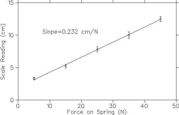
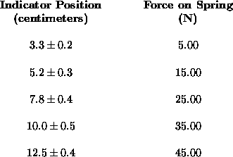
As an example, suppose that we wish to plot the curve showing the relation between the observed position of an indicator on the end of a spring and the force pulling the spring, and suppose that we have made the following observations:
Which shall we plot along the ``horizontal" x-axis and which along the ``vertical" y-axis?
[ The terms ``horizontal" and ``vertical" are of course not literal, but based on yet another perceptual convention about the orientation of the two-dimensional surface on which the graph is being drawn; all this may become considerably more confusing when 3D ``virtual reality" computer interfaces become more widely used. ]
A general rule is to plot the independent variable along the x-axis (also known as the ordinate) and the dependent variable along the y-axis (also known as the abcissa). In other words, if the position of the indicator on the spring is to be expressed in terms of the force on the spring, then plot the force on the x-axis and the indicator position on the y-axis. The scale units are chosen with consideration both for convenience and for the size of the diagram.We now make the assumption that the relation between the force F applied to the spring and the extension s of the spring is given by Hooke's Law,
![]()
written to include
![]() ,
the position of the indicator when F = 0.
,
the position of the indicator when F = 0.
We therefore expect a linear relation between F and s, so we draw the best straight line through the points.
[ Of course, if we stretch the spring too far we will discover deviations from this ideal behavior. Most physical ``laws" are applicable only within certain limits with which the user is expected to be familiar. This expectation is frequently frustrated.... ]
If we now wish to determine the spring constant, k,
we can do so easily from the slope of the line.
The slope is obtained by taking two points on the straight line
(NOT two experimental points, because the straight line
represents the best fit to the experimental data), say
![]() and
and
![]() ,
and forming the quotient:
,
and forming the quotient:
![]()
As a rule, it is convenient to choose points such that
the difference
![]() comes out to be a simple number;
in this way, the process of division is simplified.
In this example, since F is plotted on the x-axis
and s on the y-axis,
comes out to be a simple number;
in this way, the process of division is simplified.
In this example, since F is plotted on the x-axis
and s on the y-axis,
![]()
where
![]() and
and
![]() are any two points on the best fit line and so
are any two points on the best fit line and so
![]()
Subtracting the first of the above equations from the second,
![]()
so that
![]()
The slope in the example shown on the following page is 0.233 cm/N. Thus
![]()
Note that since we used the slope of the best-fit line rather than a single
point to calculate k, we did not need to find
![]() .
However, this calculation is only as good as our ability to
draw a straight line through the mean of the points.
There are criteria, such as the ``least squares fit," which make
it possible to find the curve which best fits a set of points. If such a
method had been applied, the use of the slope would certainly yield a better
estimate than a single point or pair of points. Usually we will not use
such techniques and will fit curves to data visually. Such a fit is easily
made with the aid of a clear flat plastic ruler.
.
However, this calculation is only as good as our ability to
draw a straight line through the mean of the points.
There are criteria, such as the ``least squares fit," which make
it possible to find the curve which best fits a set of points. If such a
method had been applied, the use of the slope would certainly yield a better
estimate than a single point or pair of points. Usually we will not use
such techniques and will fit curves to data visually. Such a fit is easily
made with the aid of a clear flat plastic ruler.
Figure: Hooke's Law: Position of Indicator versus Spring Force